The Scene Movie Theater App
My First Design
The Scene is a movie theater ticketing app that strives to provide users with a simplified ticket ordering process. The Scene targets users who want a quick, streamlined process while being provided with all of the necessary information

Product Overview
Movie Theater lovers don’t want to go through the hassle of ordering a ticket, just to decide to purchase at the theater because the process was too tedious.
My goal was to design a movie theater app that allows users to have a streamlined, calibrated, and quick ticket purchasing process.
My Role
Ux Designer and Researcher
Duration
March 1st - 31st, 2022
The Process
Interview
After conducting interviews, conducting a competitive analysis, and creating empathy maps to understand the users and their needs, two primary user groups were identified.
-
First, movie theater aficionados rely on movies as boredom-relievers, but also as a hobby.
-
Second, parents who want to take their kids to the movies but can’t be bothered to deal with tedious checkout processes and seat selections.
Both user groups identified a couple of different reasons for not using a movie theater app: often times there is neglect from apps to provide streamlined and calibrated ticket purchasing. Mainly, busy parents don’t have time to deal with a seat selection process that isn’t fit for mobile screens or a checkout process that takes abnormally long.
Pain Points
Tedious
Movie theater apps typically have a tedious check-out process of inputting emails and card information. Going forward, this app will provide a streamlined version for check-out information.
Calibration
Oftentimes, selecting seats can either be confusing about whether the seats are taken or not or tapping the screen will move the image. This app will ensure clear imagery for selected seats and calibrated to fit cell phones.
Accessibility
To de-clutter, mobile apps leave out crucial information for accessibility. To overcome this, each theater will provide accessibility information
Offline Access
It’s expected that all theaters have Wi-Fi/internet access or have a strenuous task list by going through emails to see tickets. Tickets are accessible from the main page and are accessible in offline mode.

Personas
Based on the interviews/workshop I created two personas. I referred to them throughout the entire design process.
Problem Statements
-
Edward O. is a movie theater aficionado who needs an easier checkout process for movie tickets because manually inputting information is tedious.
-
Amber M. is a single mother of 5 who needs a more calibrated and clearly defined seating process because taking care of 5 girls should be her main priority.
Wireframes
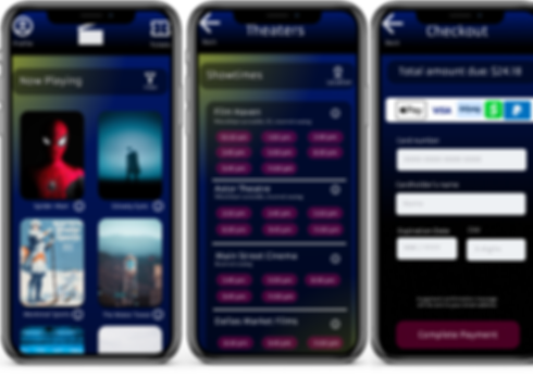
At the beginning of my design process, I used paper wireframes to ideate better and faster but later transcribed these to digital wireframes. The original rendition had a navigation menu, but this felt unnecessary for my purpose. The top bar now allows for profile information, a logo, and ticket information. The rest of the page would provide a scroll-down list of the most recent movies available. This should provide ease of use and a streamlined check-out process for users.


Wireframes
Upon selecting a movie theater, you’re immediately directed to movie theaters with corresponding showtimes. You can narrow down your search by location using the filter icon.
I wanted accessibility information to remain at the forefront of users' selection of theaters. Oftentimes, this information felt hidden or user's had to go out of their way to see it. Selecting the "more information" button would allow users to be directed to another page to view information on the theater.
Wireframes
The last few slides I created during the wireframing process had users selecting seats (which had the number of seats tied to the number of tickets), checkout information, and their final ticket. Handicap-accessible seating arrangements were clear, but the availability of seats was not. The seating and checkout page is where the most change occurred after my second round of testing.


User Testing
I conducted two rounds of usability studies. The first study provided me with the basis to design my mockups. The second study used a high-fidelity prototype and defined some aspects to further expand on.
Round 1 Findings
-
Users need better cues for noticing the ticket icon.
-
Users need a “view more” icon next to displayed movies to read further information before deciding.
-
Users need a pop-up after movie selection, allowing them to specifically state the number of movie tickets.
Round 2 Findings
-
Users need a larger more information icon.
-
Users need more apparent visuals of the front and back of the theater for seat selection.
The Final Product
UX Design
In the original rendition, I implemented a navigation bar without fully thinking about what the bar was. At this point, I was also not aware of Gestalt’s principles of design.
After the usability study, I removed the navigation icon altogether (there was no use for it), added a clearly defined ticket icon, a “more information” icon, and used Gestalt’s principle of common region.

UX Design
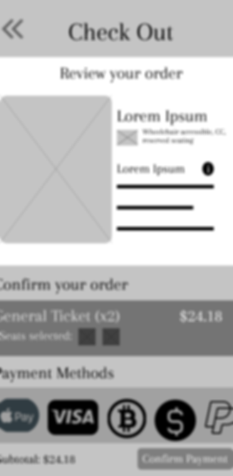
Original renditions connected the seat selections to the number of wanted tickets. My research suggested that user's found this confusing.
After the usability study, I created a ticket selection page that allows users to specifically state the number of wanted tickets before selecting seats..
.png)

.png)
Accessibility Considerations
Icon Size
At first, the “more information” icon was on the movies, and sometimes hard to see or press due to the size. I’ve increased the size of the icons and placed them next to the text to create better navigation.
Theater Info
Listed with every theater and showtime is clearly defined accessibility information, such as, “closed captioning”, “wheelchair accessible”, and “reserved seating”.
Conveyed Information
Borders, bold text, and text is used to convey information rather than simply using information. Things like logos have text underneath to explain the usage and selecting a movie causes the movie image to change size during page change